Giant cruiser budget build

It would stick out too much, unless thats the look you want.

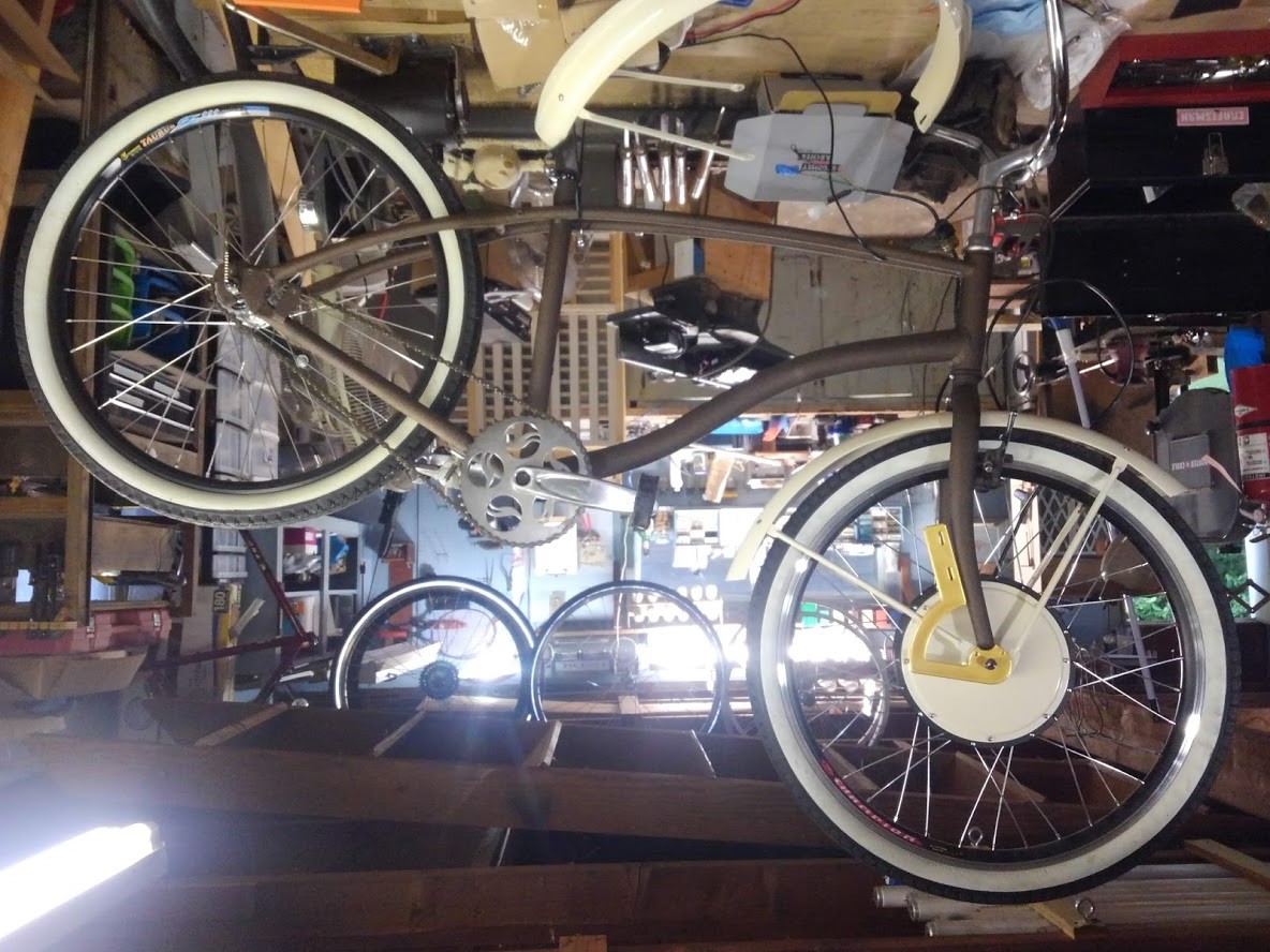
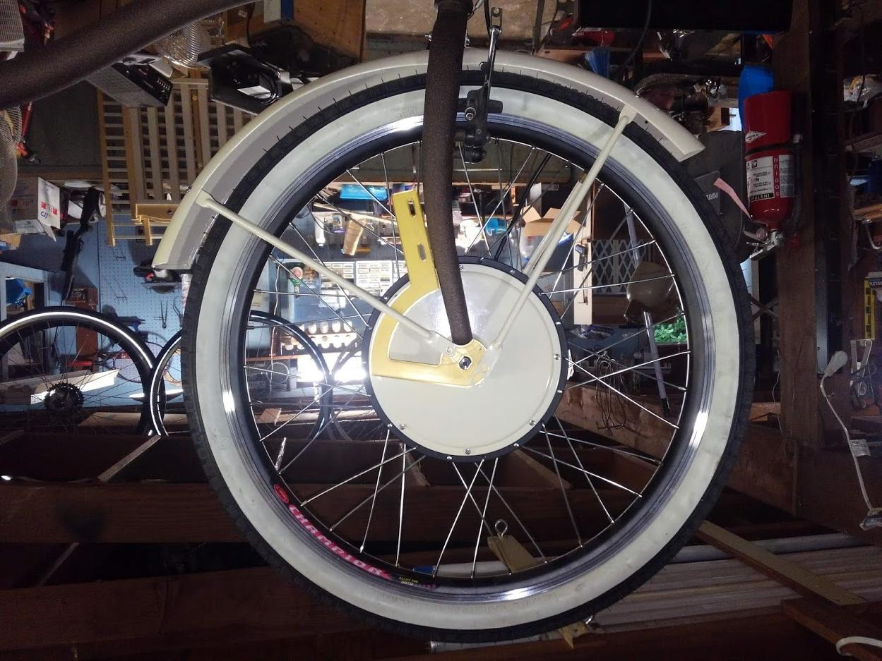
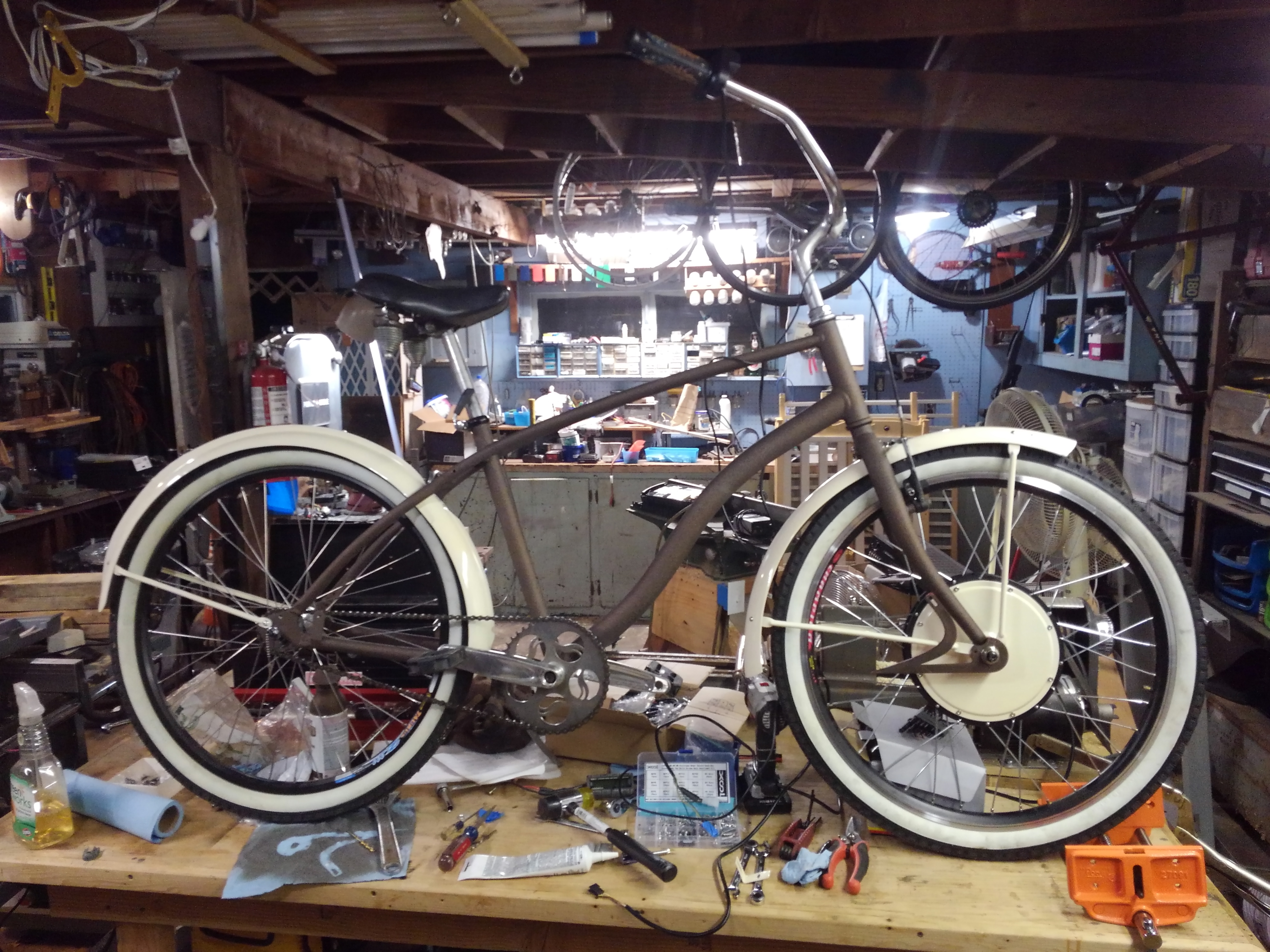
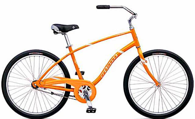
Its easier to hide the motor when its on the back wheel.

For the front wheel motor
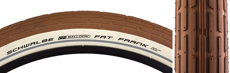
I personally would go black mud guard, black mounting poles, black cover, 100% black tire, then find a 255mm disc brake rotor to confuse the eye, ideally you'd want one on both sides of the front motor (I know I know cant put rotors on both sides, but I'd find a way to make a non working rotor to fit), even more ideally you'd want the rotors to be more full of material - with fewer open spaces, but still have it look like its a disc brake rotor.

This ones for Harleys but its the point I am getting at
http://i.ebayimg.com/00/s/MjUwWDI1MA==/z/EJkAAOSwstxVSrGG/$_35.JPG
Bicycle - https://bikerumor-wpengine.netdna-ssl.com/wp-content/uploads/2016/11/Alpha_Ceramic-Rotor-RS_carbon-ceramic-bicycle-disc-brake-rotor_hand.jpg
https://i.pinimg.com/736x/89/dd/b4/89ddb4cc6d1d05afa9fde28cea34768f.jpg

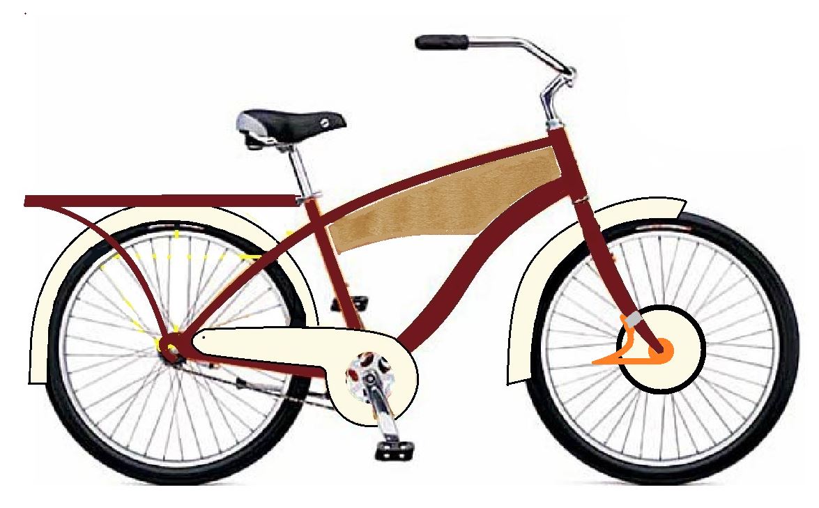
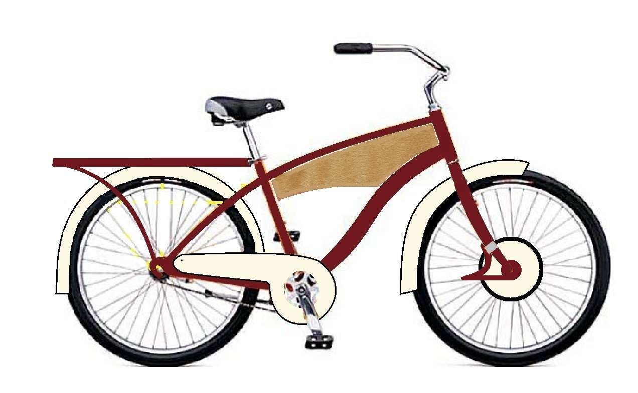
Disc rotor guard is an interesting angle of approach to hide a motor
http://leagueofbikepolo.com/sites/leagueofbikepolo.com/files/max6_web.jpg
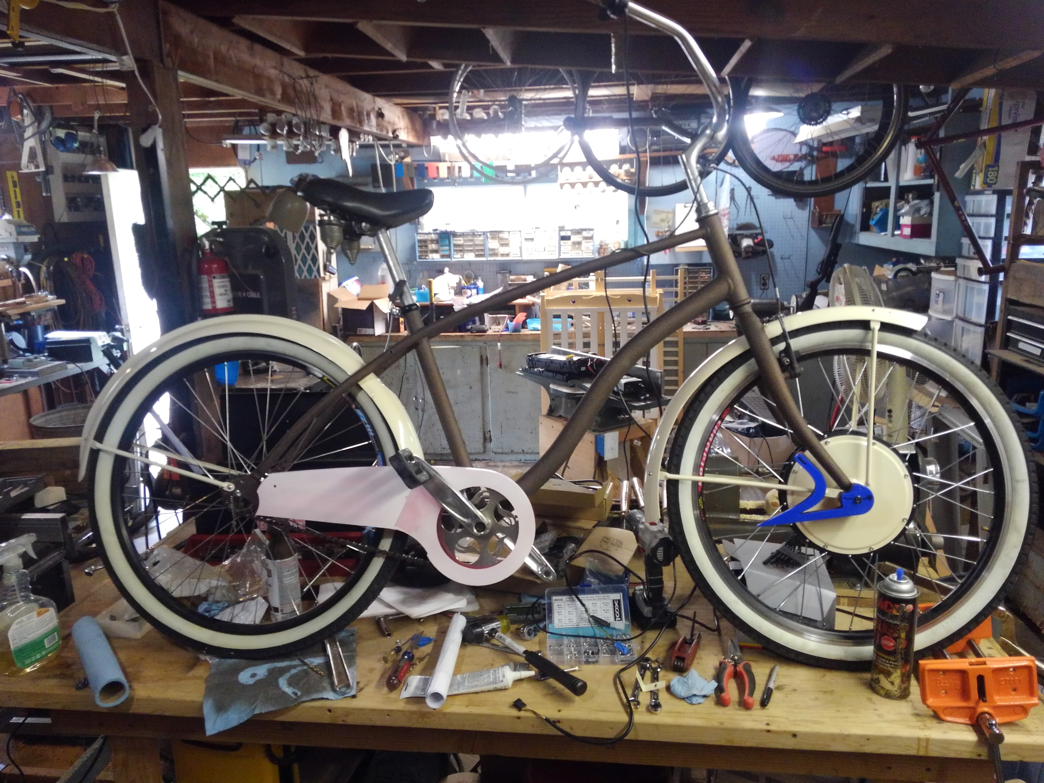
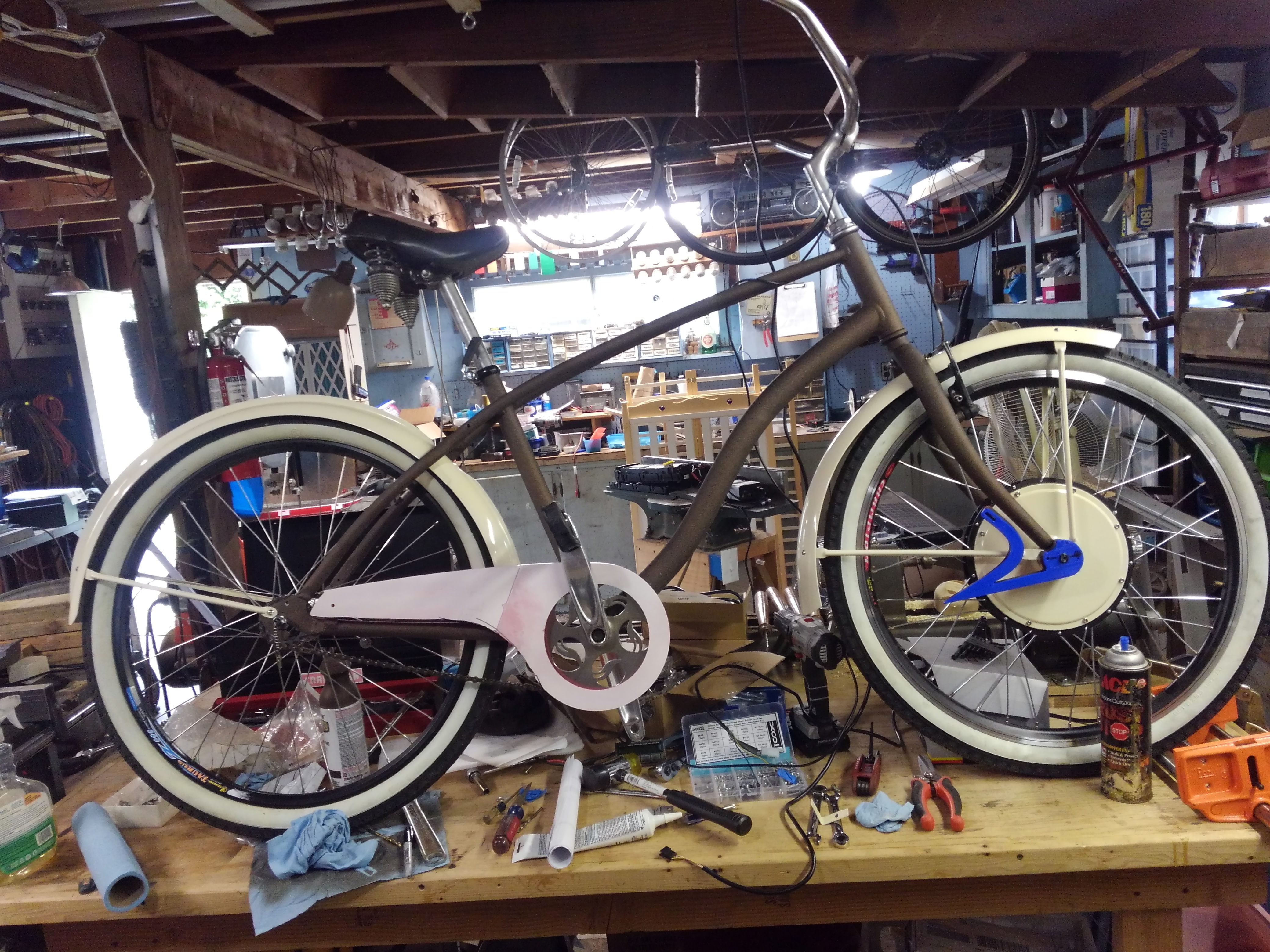
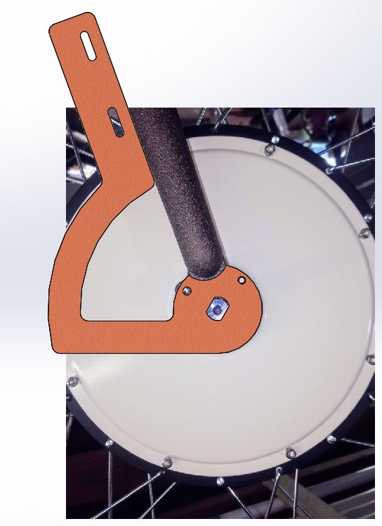
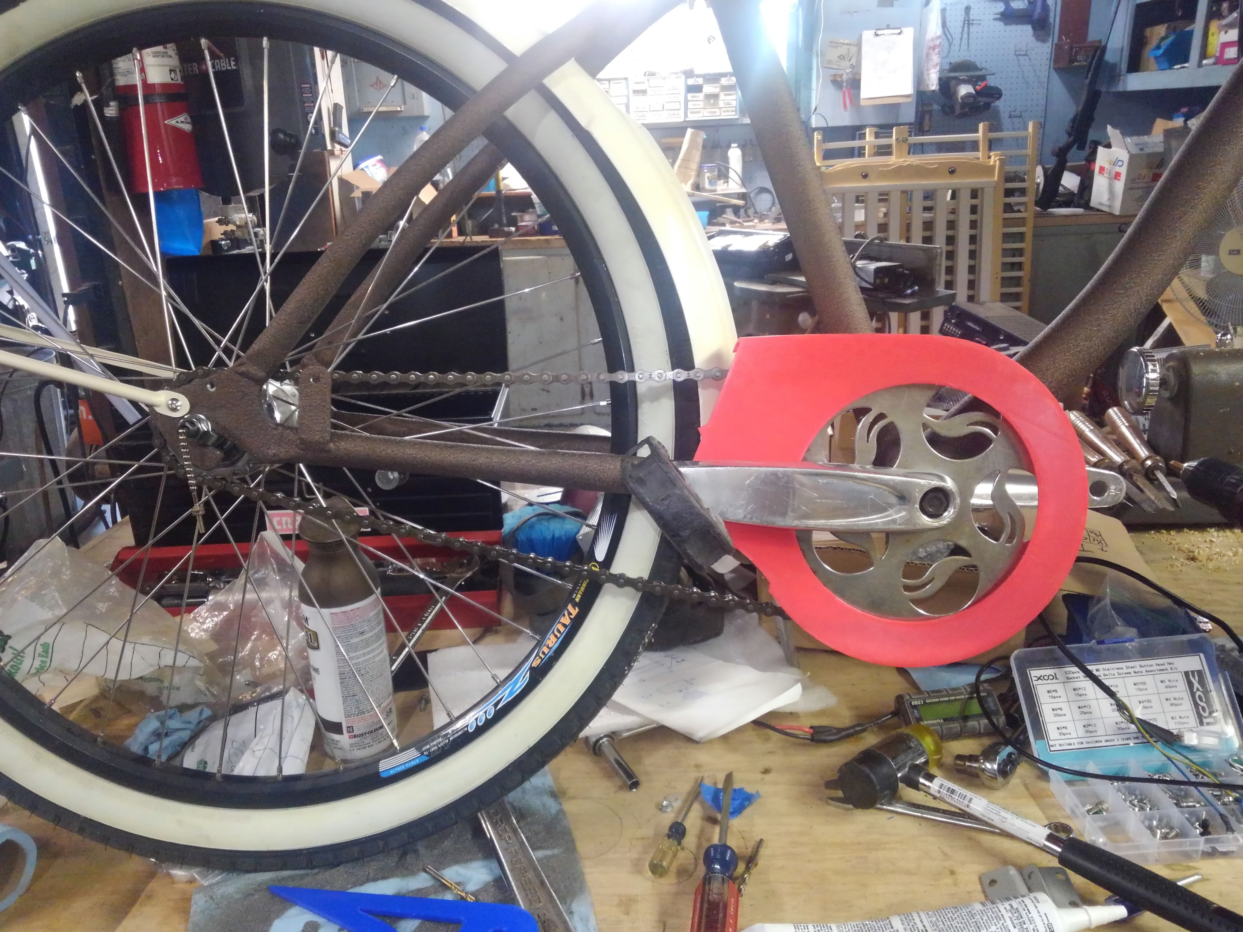
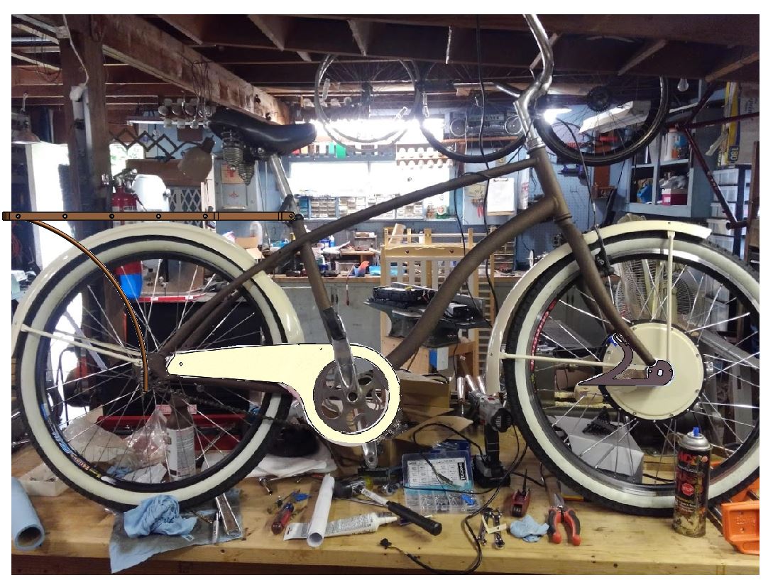
 
I'm not trying to hide the motor, but thanks for the input. Mostly trying to enhance it by providing contrast in the middle that isn't a big black disc.. it didn't really fit well with the rootbeer and cream theme I have going.
 
Now we have a mocked-up torque arm, which I'm going to 3D print for fit and to check aesthetics (spray paint a color, see if it works with everything else). Once I see if it fits, I'll iterate the design or use it as a pattern to cut from 3/16 steel.

KV5O6pw.jpg
 
dequinox said:
Now we have a mocked-up torque arm, which I'm going to 3D print for fit and to check aesthetics (spray paint a color, see if it works with everything else). Once I see if it fits, I'll iterate the design or use it as a pattern to cut from 3/16 steel.

KV5O6pw.jpg

If you use both the fork tip eyelets, you definitely do not need the tortuous upper section of the torque arm. Since it's so much more flexible than the eyelets, it won't actually transmit any torque unless the eyelet screws both break or fall out. Just make sure that the slot that fits the axle is as tight as possible.

My front hub motor is in a fork with only one eyelet per side, and I set up one torque arm on each side, anchored to the eyelets. It makes 99Nm of maximum torque according to the Grin simulator. It consumes close to 1700W peak power.
There's no movement at all in the torque arms, and the fasteners have never become loose. If you play your cards right, your torque arms can fit only on the fork tips but still have twice as much torque anchoring as what I have found to be reliable.

Consider how relatively little torque can be jammed through the axle flats before something goes awry. The anchoring for your torque arm only needs to be that strong, and does not improve in any way if you have more than that.

IMG_20190201_131354.jpg

IMG_20190514_164405.jpg
 
That's fair, and I hadn't done an FBD with associated calcs yet to check how heavy a design I needed to go with. I definitely appreciate the input. I'm hoping to incorporate the torque arm as a sort of stylistic element as well as a functional one, and will certainly be including one on both sides for symmetry.

If you look at the above V1 of my cad model, it has a hole where the eyelet is just for that purpose and to include mounting the legs for the fender. I 3D printed this version yesterday, and gave it a mock fit-up this morning to see how it looked. I have a revision to do... :) The upper part of the torque arm is a little massive, and I think I should thin it out overall, plus I need to change the angle of the flat part to be level with the ground.

8qTWU4F.jpg

SFQif1P.jpg
 
I don't think your design complements the bike. The shape should have more "flow" to it with curves and shouldn't have simple (constant radius) curves, and should have few or now straight lines and/or 90 degree corners. Just look at the curved tubes on your bike for inspiration.

BTW, I think the cream paint on the hub is on target.
 
I don't think your design complements the bike. The shape should have more "flow" ... I think the cream paint on the hub is on target.

Thanks for your input. This is version 1, so I have a lot of room to try things out design-wise, and a 3d printer to iterate which helps speed things up with minimal effort on my part fabricating a new part each time. I would use cardboard mock-up, but... how much fun is that?? :mrgreen:
 
Two cents.

Functionally I'd get rid of the arm beyond the curve, since the radius is already a few inches from the axle so the forces are reduced several fold already.

Aesthetically, I'd parallel the arm with the fender support and not cut out the portion inside of the radius (would be shaped like a piece of pie), but add some design elements (machine radial grooves, contrasting paint, etc) to make is look less like a torque arm but part of the frame/fork.
 
Here's where I'm headed with the design at the moment. I'm also still planning to build my own back rack as I cannot seem to find one that meets my requirements commercially.

ASRW0cp.jpg
 
dequinox said:
Here's where I'm headed with the design at the moment. I'm also still planning to build my own back rack as I cannot seem to find one that meets my requirements commercially.

ASRW0cp.jpg
Two more cents.
I like it. The chain guard balances out how your contrasting colors flow with the hub and fenders. I think if you go with this torque arm design, making it the same color as the frame and rack would tie both the colors and curves (rack and TA) together.
 
Two more cents.
I like it. The chain guard balances out how your contrasting colors flow with the hub and fenders. I think if you go with this torque arm design, making it the same color as the frame and rack would tie both the colors and curves (rack and TA) together.

Thanks, I was toying with the idea of adding in a third color on the following scheme:
Ho3QrfI.jpg


I wanted to pick something contrasting the other two for things like brackets, fittings, accessories, etc. The orange for the torque arm doesn't seem quite right. A contrasting third color there would only be distracting I think...

Here's with the torque arm color changed.
o1k5TUZ.jpg
 
I'd just use black for any small bits and bobs here and there. Or the same cream color as elsewhere. Or chrome, if they already come chromed.

I'd also paint the hose clamp the same color as fork and arm.
 
I love these milestones where you know you're headed in the right direction with something you've been working on a while...

1HfoANe.jpg


Pardon the busy background here. At some point I'll get a proper shot against a solid background.
 
The bike is looking nice. But a subtle thing hit me as I was looking at it. The flat or semi-gloss black rims are out of place. Those rims should probably be chrome or at least aluminum. Alternatively, but probably visually appealing would be to paint the rims (not the braking surface part though) the same cream color as the hub motor covers.
 
I have been toying with this idea, thinking I'm going to go for it as i like the look, and hate the twist shifter look.
hwtjdSc.jpg

DyrX7zR.jpg
 
Welp. There's half a chain guard. The other half is printing now... It won't stay red this is just a prototype. I have at least another two revs to do i am betting. If joining the two pieces goes well i might use the print as the actual end part for a while, it seems stiff enough and is very light.

eR1JQPy.jpg
 
I dont know about that mate, I think black would be more suited with the frame color. I agree though the t.a. should be the same as the frame, and the artistic "V" shape adds a nice touch IMHO. The chain guard, to me, throws the eye off the curves. I think the eye of the viewer should be "pointed" towards the curve of the top bar, and your battery "gas tank" looks good if you can keep it not bulky to the visuals from the side.

E-HP said:
Two more cents.
I like it. The chain guard balances out how your contrasting colors flow with the hub and fenders. I think if you go with this torque arm design, making it the same color as the frame and rack would tie both the colors and curves (rack and TA) together.


I agree, flow is good with the curves, like I said the curve of the top bar, with that battery placement design / "gas tank" is good. I would see what I could do to make it vintage 60's style gas tank.
http://vintageschwinnbicycle.name/images/1956-SCHWINN-RED-PHANTOM-MENS-TANK-BICYCLE-VINTAGE-SPRINGER-PANTHER-BLACK-B6-DX-12-umop.jpg

Perhaps a more compact t.a. is in order, all depends on your personal preferences of taste. At first I kinda dug the "V" shape to the t.a. but now thinking about it, it does throw the eye off the beauty curves of the frame design. I think the focus should be more on the frame curves, less on the "auxiliary" items (t.a., chain guard, motor color) The motor color to me, should fade into the background and not grab attention, otherwise it confuses the eye.

wturber said:
I don't think your design complements the bike. The shape should have more "flow" to it with curves and shouldn't have simple (constant radius) curves, and should have few or now straight lines and/or 90 degree corners. Just look at the curved tubes on your bike for inspiration.

BTW, I think the cream paint on the hub is on target.
 
I appreciate all the input, and I will consider stuff that's possible at this point. Shape, positioning, maybe input on other visual elements that haven't been made yet. For example, i haven't really figured out what the console is going to look like and i still have to figure out a head and tail light.

Backtracking to black and chrome after I've already powder coated nearly 80% of the parts in another color scheme isn't really something I'd consider at this point. I like the color scheme, and will continue with it. I could use input on the above items though. I have two small kids to raise while i do this which is why it takes so darn long...

Also just as a reminder this was the original aesthetic, chain guard included:
VfpKXna.jpg
 
I like your cream and root beer theme just fine. It seems appropriately retro to me. The chainguard makes sense to me as well. I'd look to a "bullet" style headlight and for style would like to see it mounted to a fender. But mounted to the fork, fork stay or handlebar stem would be OK too. You probably don't want chrome (maybe chrome trim?) but would probably paint it to match your current scheme.

https://www.amazon.com/GOODKSSOP-Vintage-Bicycle-Headlight-Safety/dp/B012EXHV52
 
I like it, generally. For a retro headlight, check the thrift stores for a retro goose-neck desk lamp..they often have a hooded bullet head, with vents, that will hold the guts of a rechargeable LED spotlight.

I've often wondered if a front hub motor, with appropriate vents and torque arms, could evoke a double leading shoe front brake of an old cafe racer...http://mycaferacer.blogspot.com/2007/01/disc-brake-vs-drum.html
 
classicalgas said:
I've often wondered if a front hub motor, with appropriate vents and torque arms, could evoke a double leading shoe front brake of an old cafe racer...http://mycaferacer.blogspot.com/2007/01/disc-brake-vs-drum.html

Wow, copper would be cool.
 
Wow, copper would be frickin awesome... I've been contemplating working in the "trim" (what is now chrome) pieces with a copper metallic powder, but then realized the spokes and rims would stick out against it... Not sure what I'll do yet there. I want the metallic pieces to stand out a little against the bronze backdrop. I'm not sure if chrome is quite right yet.

Made some progress on the chain guard over the weekend. I started out with this:

6PbDRmV.jpg


Too much chain guard, so i cut it back and will revise the CAD as i have some other changes to make to.

7EaI2HE.jpg
 
An update on the back rack... I think I have the geometry figured out. I built the top part, but it turned out to be too short. I'll extend it and post a photo when I have it dry-fit and about ready for powder coating. I went the wrong direction a bit with the chain guard design, so I'll post another image with my prototype on there when it's correct.
HzpDZsX.jpg


Thinking ahead to nicer tires, the Schwalbe fat frank came up:
590984.jpg


Thought those mite looka niiiiiiiceeeee. :pancake:
 
" I'm not sure if chrome is quite right yet."

I'm a decorative metal fabricator, so I've seen and used range of metal finishes, and I'm not a fan of chrome myself. Some options that occur to me...

1) nickel plating...is softer than crhome, so takes a patina (or can be patinated) to soften the gloss. It has a warmer silver tone than chrome, and it's an old finish, so it looks retro. I particularly like a fine bead blast with an electroless nickel finish (electroless can be done at home, there's no electric current involved, you just heat the plating solution) For an idea of apearance....https://www.unitedsurfacefinishing.com/service/electroless-nickel-plating/

2)Copper or brass plating...even more warm and retro than nickel, but a little overused on custom bikes, and harder to maintain, especially in a non glossy state.

3)Powdercoat...not as tough as plating, it will chip, scuff or scratch given enough abuse. Threads need to be masked off, clearances (where parts fit with other parts) need to take that into account. Almost any color is available, including fairly convincing metalics. Some metalics will darken with oil (fingerprints even)

4)Make your shiny parts in stainless steel, patina them with fine sandpaper/Scotchbright/bead blast. Stainless is a little tougher to work with than mild steel, but you save on your finish. Stainless looks very much like electroless nickel.

So the questions are...what's your "bling" budget? and how retro are you trying to go?
 
Back
Top